
I did have a slight problem at the end. The hands did not go together seamlessly like they originally did. I do not know why but there was a slight gap, I am not happy about this as I feel it spoils him a bit. I don't want a buyer to get him and see these and get upset. :( However, I cannot think of a way of fixing it without GSing over the gaps. So, it will be left. I have tried to cover them as best I can. *shrug*
Anyway, before the pictures go up, he will be going on ebay later this week (I'm going to post a link to it when he's up), so feel free to bid on him! This is mainly a small project to see if I am good enough to occasionally earn a little bit of money on the side. It be nice!
Now... photos.


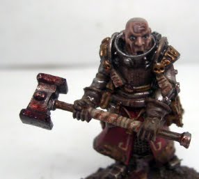
Man, I really love the gritty look of this guy. He looks like he has seen battle for sure. Great job.
ReplyDeleteGreat job mate! If I had one criticism (more of an observation than criticism) is that it looks a little shiny - the dark and gritty paint job would benefit from a matte finish. I wouldn't change it now though.
ReplyDeleteI don't if others have any better advice for lettering, but some things I've found that help are:
a). Once you've put the lettering on, use the scroll background colour to "narrow" the letters - it seems easier to paint over the excess black, than it is to paint a thin line.
b). Start with the middle letter(s) and work outwards
Other than that, good work! :)
He's turned out to be a great model.
ReplyDeleteAndy's advice regarding lettering are very sound, so next time heed his words, and I'm sure you'll get a result you're more happy with. Also remember to dilute your paint (if you don't already) when doing freehand, it's much easier to control.
Jcroxford - Thanks, that's kinda what I was going for.
ReplyDeleteAndy - Well, he hasn't been varnished yet, so he might look shiny. I'm also thinking the photos were a bit too bright to show off the details well. Might look at taking some more.
I tried that, but by the time I got around to it the mix had dried and I couldn't get it quite right. I tried the start in the middle, I just need to practice more.
Thanks for the advice.
Noeste - Thanks. It was diluted, I might just have to be sure to wick more off the brush next time.
Thanks guys.
regarding lettering. One thing I just recently started doing was using a micro pen instead of brush. For me my hand is a lot more stead at writing letters vs. painting them.
ReplyDeleteJc - I have considered that, but I'd like to be able to paint them on should I wish to. But yeah, its something I haven't tried.
ReplyDeleteAh, sorry mate, I thought it looked like a glossy varnish. :(
ReplyDeleteI tend to use a flat pure colour like Dheneb Stone for the area where I'm going to do the lettering. Then I use a thin carefully applied glaze to shade, after I've done the lettering (and the foundation paints are obviously great for painting over black).
No worries. I did use some gloss varnish in the darker mud.
ReplyDeleteI used a different mix. I think I just need more practice. =)