PART TWO
So, picking up from where I left off – The New Army. I decided a while ago that I wanted to make them stand out, to be MY dwarfs. With this in mind, I went about looking for a good colour scheme. I didn’t want to do the typical colours, which for dwarfs are red, white, blue and green. Usually it is white and… this I did not want. I wanted a scheme that stood out, but did not call in the Gay Pride Parade with its choice of colours. I did originally do about five dwarfs in a light grey and light blue scheme, but it just didn’t seem to suit them. In my opinion, I have always found that dwarfs look better in darker colours; which is why the 6th ed GW scheme of Dark Angels Green and Brown worked really well. It had an earthy feel about it. I wanted my dwarfs to have some of this feel without them falling into the ‘typical looking’ dwarf army trap. I believe I have achieved this.
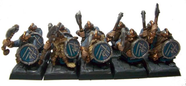
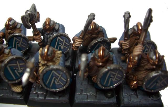
My scheme uses grey as the darker colour to help bring the feel of hard, stone or earthy tone to the look. The blue colour is actually turquoise, a colour I feel is underused in Warhammer. I also felt that it worked really well with the mid-dark tone grey (Shadow Grey), neither of them would blend into any beard colour I am going to use and they are strong enough that they stand out quite well. I am looking forward to seeing how it looks on mass (I currently have 15 warriors, 12 Quarrellers, 10 warriors, a thane and a runesmith painted with more warriors, Thunderers and a cannon to go). There is, of course, the utility colours going in, I am still playing about with some stuff but I am slowly getting it sorted out. For example, I know that the secondary metallics will be bronze for the most of the army. My characters and elites will most likely have gold for their main colours; to show their elite..ness. I need to work on the silver metallics, they don’t quite look right at the moment. Otherwise, I am happy with their overall look and feel. I am pretty happy about the bases, my Greenstuff Flagstone Stamps, work quite nice however they are not level or regular. In some ways this is good, they all look consistent but up close some a rather messy; that I need to try and sort out properly. The colour tone I am also playing with. The first set of bases (as you’ll be able to see later i.e. Below) are too light, the newer ones are quite a bit darker and I think look better.
There was one big thing I wanted to do with my dwarfs was freehand. I am sick and tired of not doing this because I cannot do freehand. So, I decided that the only way to sort that was of course to do it. The more I do it, hopefully, the better I become. So, the dwarf shields and unit banner will all have some image painted on them. I’ll come to the banner in a minute, for now I would like to discuss the shields. I HATE the shields that come with the warrior boxed set. I like the designs, but the fact you cannot choose to add these icons to them is annoying. I dislike that a bunch of the plastic fantasy kits that GW produced in 7th ed took a lot of choice away from the hobbyist. The shields also, to me, don’t feel dwarfish. I have never thought as them as being the convex shape GW made them, but rather a big flat wall of hardened steel. I like the flatter shield design, and I have a plan for my Ironbreakers shields also (if there isn’t new ones by the time I get round to them). So, my shields are done using the old 6th edition dwarfs shields. These give me a nice big empty space to paint a design on (mine is two inverted V’s being split on one side by an arrow – they represent mountains and the arrow is the ‘delving spear’). However, to do these shields I have to get hold of these shields. I can buy them from GW for £2 for eight (two sprues of four), or I can wait and return home and hope to yank the icons from some others off the arms of the older dwarfs. I am not sure yet.
Right, I said I would return to these. The banners. Again, I want to practice my freehand skills and being as the dwarfs are pretty much beard there is little room for painting any sort of design on. The banners I have decided to separate by design, by this I mean I have broken them down as thus…
Warriors – Axe designs
Thunderers – Handguns
Quarrellers – Crossbows or Arrows
Miners – Pickaxe
Hammerers – Hammers
These are the ones that I have planned out, the others I haven’t yet decided. I decided that these banners will have their ‘types’ “icon” on them in different manners. Or I did plan to do this. Then, I kinda struggled to think of different methods apart from – single and crossed “icon”. Not sure how to do these, I might add different icons to the main one.
One thing I have said about this army is that I want to make conversions. The problem is GW in their infinite wisdom decided to make them three part models – front, back, arm. That pretty much removes all the chances of doing converting without the extensive use of greenstuff. I am not ready for that yet, but I hope to try more and maybe get use to using the stuff. In the meantime, I have some metal dwarfs from various places I might have a go at converting. I have mixed views on metal minis. They look great, but hard to convert. =/
Anyway, I think that is enough “confab” for today and onto some pictures. This first bunch is of the ones I have previously done.
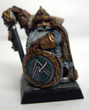 |
| Thane |
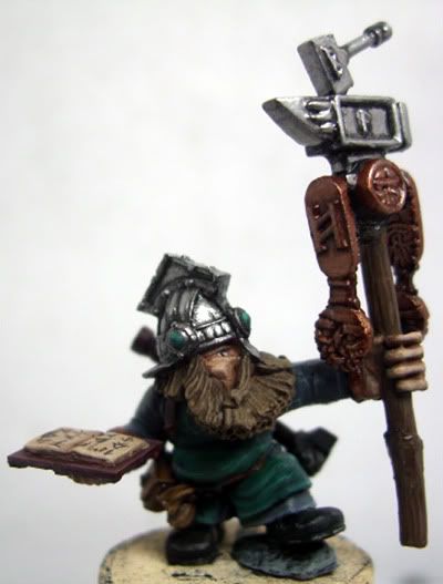 |
| Runesmith - Converted |
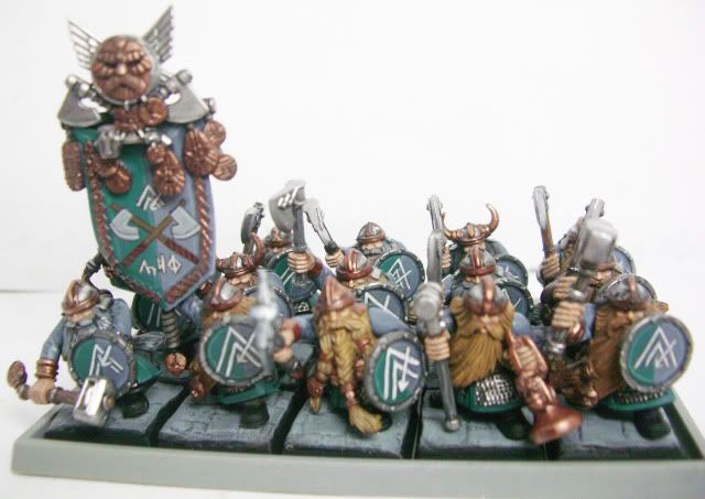 |
| Warriors |
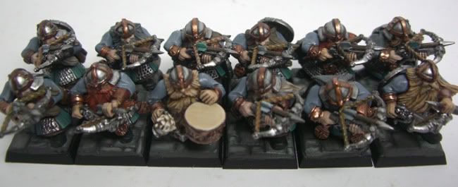 |
| Quarrellers |
And this is the new – half done unit, there is six more dwarfs to do including the command. I have now decided that my veterans (champions) will have a helmet adornment, horns, wings or something like that. To make them stand out.




Look great as always. I really like the color scheme. Very cohesive and very Dwarfy!!!
ReplyDeleteI actually saw an army online that looked pretty sweet. The guy painted his entire dwarven army to look like clockwork. They were dwarven bronze, boltgun metal and mithril silver with some shining gold and burnished gold highlights. He also greenstuff molded some miniature gears and stuff and the army literally looked like a horde of mechanical dwarves. I think the dank angels green and dark brown will look nice. Wood elven but nice!
ReplyDelete